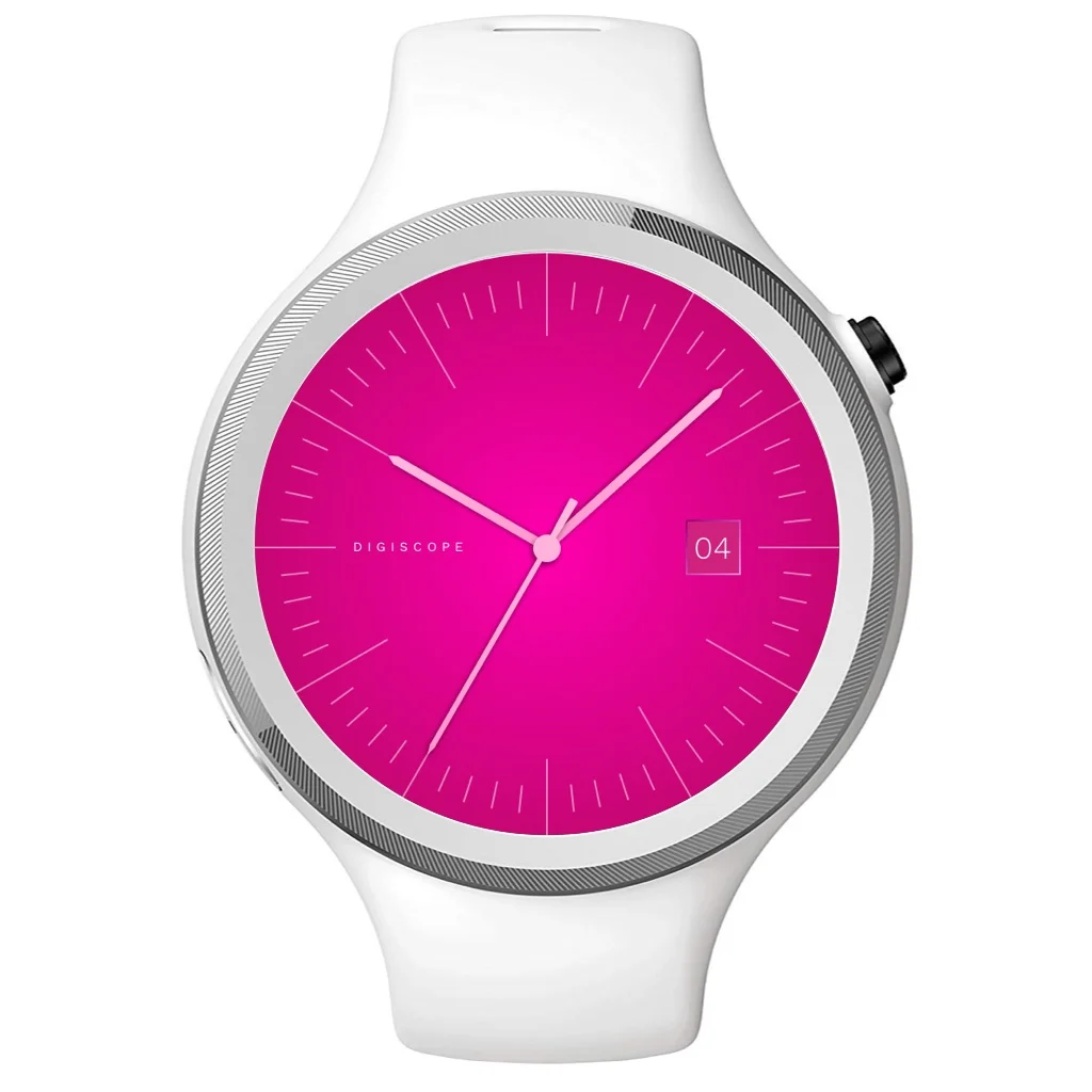
Digiscope
A simplified approach to a smart watch OS
(2014)
Interface & Navigation
The interface is constructed around a typical watch face but it adapts and segments based on the options available.
Tap for contextual information
Long press for top level navigation
Rotating a finger and swiping to the edge enables selection
Tapping in any section would enable glanceable contextual information
Interaction patterns
The UI centers around a common metaphor, the circle. The circular interface embraces the watches form.
The UI uses simple iconography to denote basic features such as time, calendar, messages, navigation and music but rather than being a standalone device (like many of the first smart watches) it would compliment your mobile phone and only show salient and simplified information for each of it’s core features.
For example: When viewing the calendar it would only show the results for that day only. Events would appear as simple markings around the watch face, clicking these would bring up only the pertinent information needed to get context for the meeting.
I felt this was the right approach to the limited form factor and constraints of the watch interface, especially as at the time many of the smart watches were trying to achieve a full set of functionality that requires complex interactions and high level of engagement that aren’t appropriate for the platform.


